We’re excited to unveil Benjamin Moore’s Colour of the Year for 2022! Introducing, October Mist CC-550!
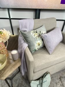
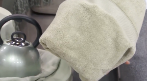
OCTOBER MIST is a gentle sage, it can be soft, dreamy and nurturing or it can be invigorating! It has an anchoring quality on its own, yet it’s also like a canvas that encourages us to be creative as it’s easy to combine with other colours from soft to bold and everything in between! For us at BM, it’s about the colour on the wall, but I had a field day going out there and finding this gorgeous green in so many homes— from bed & bath, textiles, cushions, rugs, and kitchenware! It’s also a great canvas for food prep so I wasn’t surprised at all to see it in beautiful handmade dishware.
We’re yearning for common ground, but we also want to express our uniqueness, our individuality. We need nurturing and comfort and we find that healing tranquillity when we step into nature for sure – so we want to bring that inside, but we also want to play and explore and have moments of escape!
From a colour perspective, the green colour family is the right choice for 2022. It’s balanced and stable on its own, but again it pairs so well with other colours allowing for personalization. It’s like the stem of a flower, each flower is uniquely beautiful and the stem supports every variation! As we worked with October Mist, it quickly became clear that this colour is that ubiquitous stem that encourages the use of colour!
Colour Palette for 2022
In addition, we have also curated a collection of 14 colours for 2022. More so than other years, this year all of us on the colour team felt that the supporting colours in the palette were just as important as the COTY! With a palette of 14, we had space to tell a few colour stories and provide inspiration to help make your own statement.
Green Colours
The green story as we’ve just discussed is important, so we have more than just October Mist: the pale Morning Dew which is an off-white with a green tinge, a more luminous Fernwood Green which is a classic BM Favourite! Our deepest green in the palette is High Park, which is our sophisticated, herbaceous green!
Primary Colours
We wanted the palette to be balanced AND to add a touch of levity! Pastels are key – so Hint of violet, that pale lavender is so dreamy along with Smoky Green one of my favourite pale blue-greens.
Together they are just so fresh and whimsical!
White Colours
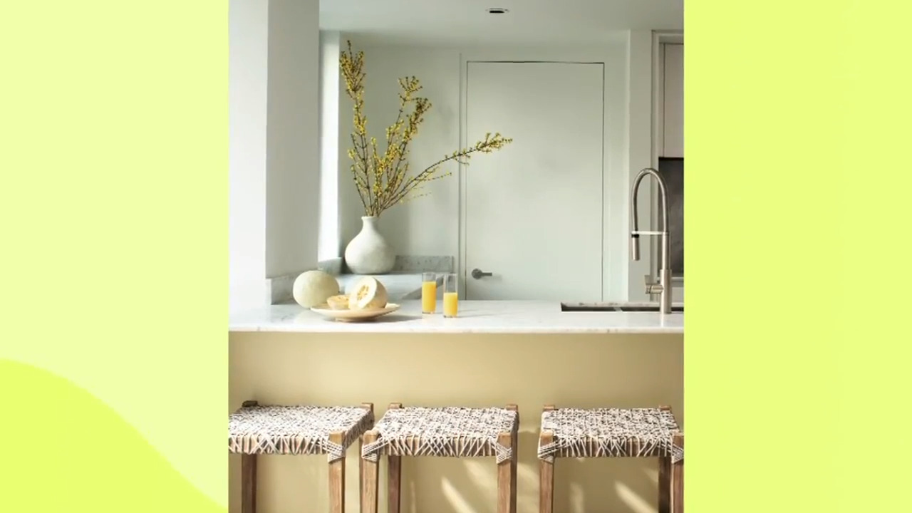
White paints are always important so we added Steam which is becoming a new classic. It’s quite neutral not too warm, not too cool and Collector’s Item which is quite warm and cozy. It has a slight blush undertone, which offers a lovely, nostalgic feel that combines well with the last colour story.
We also recommend earthy neutrals! I can’t get enough of Venetian Portico, a beautiful, sun-baked clay colour! I am dying to pair it in a room with Gloucester Sage and Natural Linen. I look forward to seeing how our viewers and guest experts are inspired by these colours!


