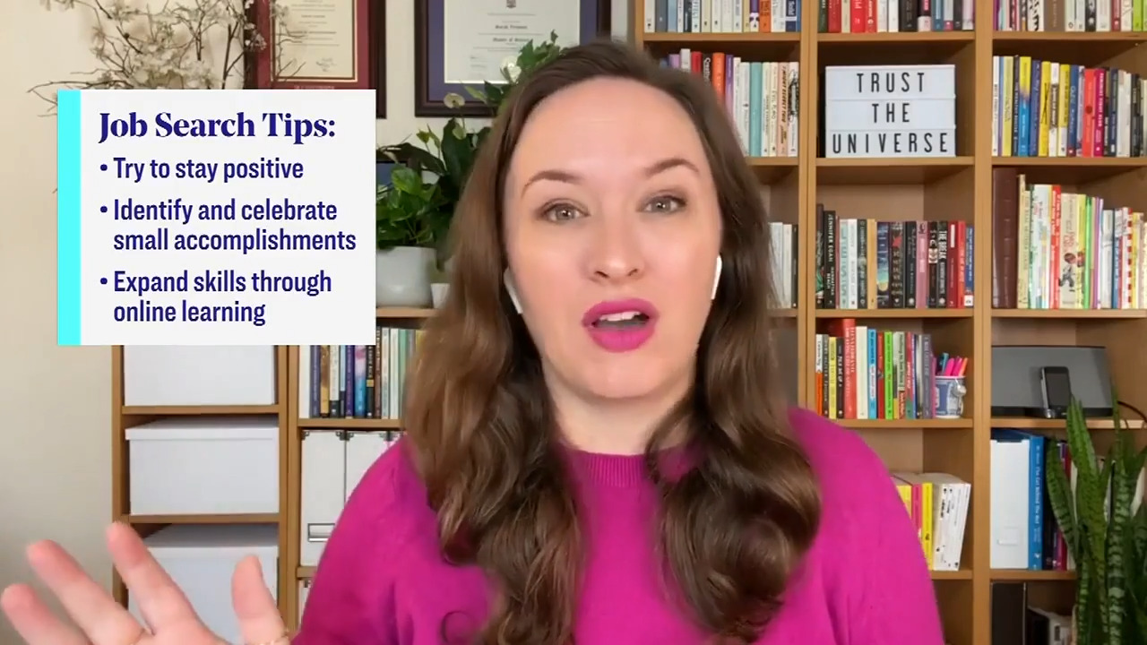
Many of us are looking for new job opportunities right now – and resumes may not be something we’ve worked on in a while. Wondering how to make sure your resume stands out? Career Coach Sarah Vermunt is sharing 3 must-do’s.
Use Keywords
Before a human even sees your application, your resume will be scanned for keywords by a software program. If it doesn’t find any keywords, it’s very unlikely you’ll get an interview. To avoid this, spend 5 minutes going through the job posting to find 5-6 of the biggest components of the job. Write them out. These are your keywords.
What you’re really looking for here is to identify the key themes of a job, and incorporate them into a resume so that the employer knows you’re a good fit. Words that are frequently repeated and phrases that mean the same thing are good indications of a key theme.
Once you’ve got your 5-6 keywords, pepper them throughout your resume and focus primarily on these aspects of your qualifications.
Replace Your “Objective” or “Profile” Section
The days of having an objective or profile to start your resume are over. Instead, a more effective strategy is to include a “qualification highlights” section at the top of your resume. This can include 5-6 bullet points outlining your experience in the 5-6 key areas you’ve identified. These should be quick, concise highlights. One line each only.
Why do this? You want the most lucrative information at the top of your resume, since that’s what potential employers will see first. Think of a resume as a dating profile – you want to show the best stuff right away. Showing them that you’re a good catch up front is a game changer that is sure to get some eyes on your resume.
It may be tempting to list all of your experience to show that you’re qualified for a job, but listing too much will dilute your resume. This is a really common mistake and a resume killer!
Formatting Matters
This is an often-overlooked aspect of resume-building, and matters much more than many people think! On average, hiring managers spend 7 seconds looking at your resume for the first pass. So make that sucker as easy and pleasant to read as possible! Don’t think you’re being clever by changing the margins or making the font smaller to cram everything in. It works against you, since it’s hard to read, especially from a distance.
Some good rules of thumb are to use a 12 point font, ensure no bullet points run more than 2 lines, and to make sure there’s enough white space, lest your resume start to feel cramped. Keeping you resume to a 2 page maximum is also an absolute must.
We hope these tips helped you revamp your resume. Happy job hunting!


